


A mobile app has only a few seconds to make a good first impression.
If users cannot understand what to do, find the right feature, trust the process, or complete a task quickly, they leave. It does not matter how many advanced features an app has if the experience feels slow, confusing, or frustrating.
The best mobile app interfaces in 2026 are not innovative simply because they look modern. They are innovative because they make complex actions feel simple. They help users discover, decide, book, buy, learn, organise, or track progress with less effort.
In this article, we examine 12 of the most effective mobile app interface examples and the UI/UX lessons businesses can use when planning a new app or improving an existing one.
What Makes a Mobile App Interface Innovative?
An innovative mobile app interface is not about adding more animations, more menus, or more visual effects.
It is about solving a real problem in a better way.
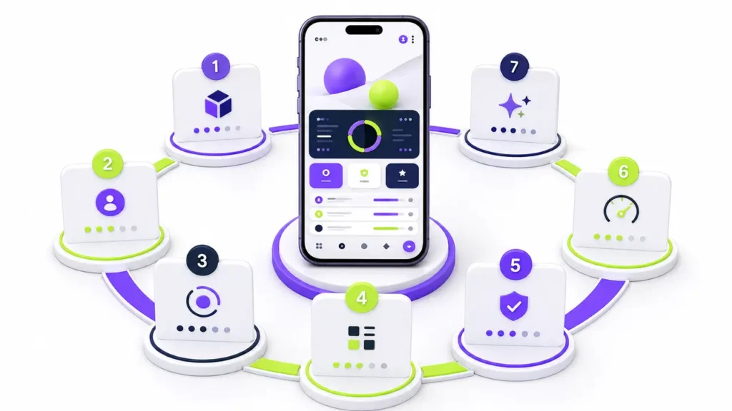
The strongest mobile interfaces usually share five important qualities:
Clear user journeys
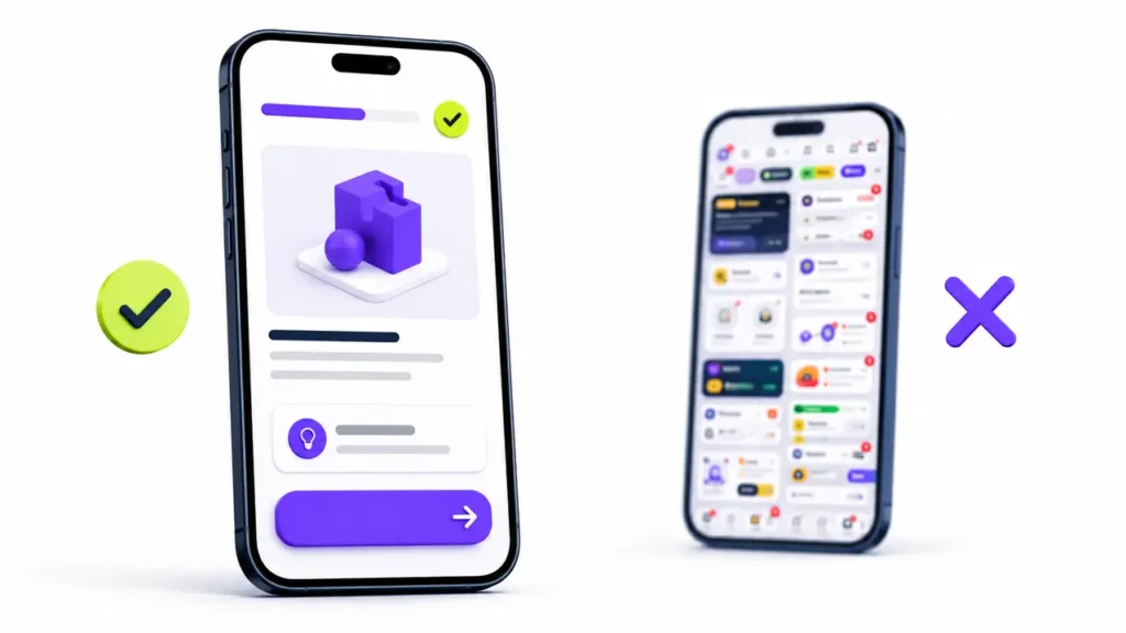
Users should know where they are, what they need to do next, and how to return if they make a mistake.
Less friction
The app should remove unnecessary steps. It should not ask for information too early or make users search for basic actions.
Helpful personalisation
Recommendations, content, products, and features should feel relevant to the user without becoming intrusive.
Trust and confidence
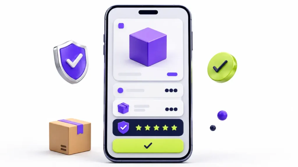
Clear prices, reviews, security details, privacy information, confirmations, and error messages help users feel safe.
Accessibility for everyone
Good mobile app design supports readable text, clear contrast, touch-friendly buttons, captions, screen readers, and simple language.
The Zonqora Mobile App Interface Score
At Zonqora, an app interface should not be judged only by how attractive it looks. It should also be reviewed based on clarity, usability, trust, performance, and conversion potential.
This is the Zonqora Mobile App Interface Score:
| Area | What it measures | Score |
|---|---|---|
| Clarity | Can a first-time user understand the screen in seconds? | /5 |
| Navigation | Can users complete key journeys without getting lost? | /5 |
| Conversion | Is it easy to buy, book, sign up, or send an enquiry? | /5 |
| Accessibility | Is the app readable and usable for diverse users? | /5 |
| Trust | Are pricing, privacy, permissions, and confirmations clear? | /5 |
| Performance | Does the app feel fast on real mobile networks? | /5 |
| Delight | Do motion and feedback make the experience better? | /5 |
How to read the score
- 30–35: Excellent user experience with strong usability and trust
- 24–29: Strong foundation, with clear optimisation opportunities
- 18–23: Functional, but friction may be reducing engagement or conversions
- Below 18: A complete UI/UX review is recommended before scaling the app
1. Duolingo: Making Learning Feel Like Progress
Duolingo makes a difficult task—learning a language—feel achievable through short lessons, visual rewards, streaks, progress bars, characters, and immediate feedback.
Its interface does not make users think about completing an entire course. Instead, it gives them one small lesson at a time.
This is an excellent example of reducing overwhelm. Users are encouraged to take the next step rather than worrying about the full journey ahead.
UI/UX lesson
Break complex experiences into smaller actions. Show progress clearly and reward users when they complete meaningful tasks.
2. Airbnb: Turning Search Into Confidence
Finding accommodation involves more than looking at attractive photos. People need to compare prices, locations, reviews, availability, facilities, host information, and cancellation policies.
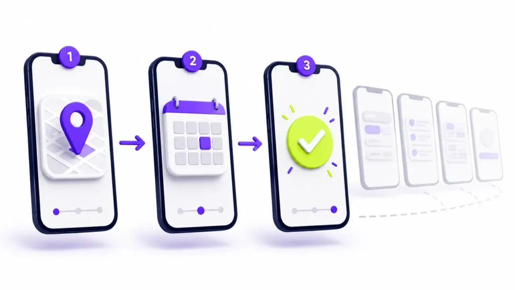
Airbnb’s interface makes this information easier to explore step by step. Users can start with a broad search, narrow results with filters, explore on a map, review property details, and book with more confidence.
The interface is designed to reduce uncertainty at every stage.
UI/UX lesson
For high-value decisions, show users the information they need at the moment they need it. Build confidence before asking for conversion.
3. Spotify: Personalisation That Saves Time
Spotify makes content discovery easier by organising music, podcasts, playlists, recently played content, and recommendations around individual listening behaviour.
Users do not need to search for everything manually. The app helps them return to familiar content while also suggesting new content that may be relevant.
This is a useful form of personalisation because it reduces decision fatigue.
UI/UX lesson
Use user data to make the experience more relevant. Personalisation should make decisions easier, not remove user control.
4. Revolut: Simplifying Complex Financial Information
Financial apps often need to show balances, transfers, cards, spending, budgets, investments, security settings, and notifications in one place.
Revolut demonstrates how a finance interface can make information feel more manageable. It uses strong hierarchy to help users see the most important information first and reach deeper controls when they need them.
The experience focuses on visibility and control.
UI/UX lesson
When an app handles complex data, use visual hierarchy and plain language. Do not make users work hard to understand their own information.
5. Notion: Powerful Features Without Overwhelming Users
Notion allows users to create notes, documents, tasks, databases, calendars, and workspaces. Despite having many possibilities, the interface lets users begin simply.
A user can create a basic page, use a template, or gradually build more advanced systems over time.
This is a strong example of progressive discovery. The product does not force every feature onto the user on day one.
UI/UX lesson
Let new users start with the essentials. Reveal advanced features when they become useful.
6. Nike Run Club: Turning Activity Data Into Motivation
Fitness apps collect a large amount of data, including distance, pace, time, heart rate, workout history, and goals.
Nike Run Club makes this data feel motivating by connecting it to personal progress. Rather than only showing numbers, it highlights achievements, guided activity, milestones, and consistency.
The app helps users understand what their activity means.
UI/UX lesson
Data should lead to action. Show users their progress, celebrate meaningful wins, and suggest a clear next step.
7. Uber: Designing Around One Main Task
Uber understands the main reason people open the app: they need to get somewhere.
The interface is built around that task. Users enter a destination, see available ride options, confirm the booking, follow the driver’s progress, and complete payment with minimal friction.
Important information such as location, arrival time, fare estimate, driver details, and trip status is shown at the right time.
UI/UX lesson
Build your main screens around the user’s most important task. Avoid making secondary features compete with the primary action.
8. Headspace: Interface Design That Supports Emotion
Headspace uses calm colours, simple layouts, gentle illustrations, and carefully paced content to support its wellness purpose.
The interface does not try to create urgency or overload users with choices. It helps them choose activities based on needs such as sleep, focus, meditation, or stress relief.
This proves that UI design should match the emotional context of the product.
UI/UX lesson
The visual tone of your app should support how users want to feel. A wellness app, banking app, ecommerce app, and gaming app should not all feel the same.
9. Apple Fitness: Making Goals Visible
Apple Fitness turns daily activity into a visual progress system. It helps users see what they have achieved, what remains to be done, and how activity is changing over time.
By presenting goals visually, the app makes information easier to understand without requiring users to read long reports.
UI/UX lesson
Use simple visual feedback to make progress easy to understand. A good dashboard should answer: “How am I doing, and what should I do next?”
10. Amazon: Ecommerce Design Built for Fast Decisions
Amazon is a strong ecommerce example because it focuses heavily on search, product discovery, comparison, ratings, reviews, delivery information, and checkout.
The app may contain a large amount of content, but it is structured around helping users find and purchase products quickly.
For ecommerce businesses, this is an important lesson: users need clarity more than decoration.
UI/UX lesson
Make products easy to find, compare, trust, and buy. Search, filters, reviews, delivery details, and checkout flow can have a major impact on conversion rate.
11. Google Maps: Showing the Right Information at the Right Time
Google Maps manages routes, traffic, businesses, reviews, locations, estimated travel times, public transport, and navigation instructions.
Its strongest design principle is context. When users are driving, they need directions. When they are searching for a restaurant, they need reviews, photos, opening hours, and distance. The interface changes according to the task.
UI/UX lesson
Do not show every feature at once. Show the information that is most useful in the user’s current situation.
12. Todoist: Productivity Without Distraction
Todoist shows that innovation is not always about adding more. Its experience is focused on helping users capture tasks, set priorities, organise work, and complete actions.
The interface is clean because it avoids unnecessary visual noise. Colour is used to communicate priority, not simply to decorate the screen.
UI/UX lesson
A productive app should make the next important action easy to find. Remove distractions around high-priority tasks.
Mobile App UI/UX Trends That Matter in 2026
The best mobile app interfaces are increasingly using these practical design approaches:
AI-assisted personalisation
AI can recommend content, products, actions, support, and next steps based on user behaviour. However, it must stay useful, transparent, and under the user’s control.
Progressive onboarding
Instead of showing users a long sign-up flow, successful apps collect information gradually and demonstrate value early.
Meaningful micro-interactions
Animations, haptic feedback, loading states, and confirmation messages should make the interface easier to understand. Motion should not delay the user.
Mobile-native features
Voice search, camera search, QR scanning, image recognition, location services, biometric login, and augmented reality can improve the experience when they solve a real problem.
Accessibility-first design
Readable typography, clear contrast, captions, touch-friendly buttons, labels, and screen-reader support should be considered from the first design stage.
Download the Free Mobile App UI/UX Launch Checklist
A visually attractive app can still lose users because of confusing navigation, long forms, poor loading states, unclear prices, or complicated checkout processes.
Zonqora’s free Mobile App UI/UX Launch Checklist helps businesses review an app before design sign-off, development handover, or launch.
The checklist includes:
- App strategy and user-journey checks
- Navigation and interface hierarchy checks
- Form, booking, checkout, and conversion checks
- Accessibility and trust checks
- Mobile performance and quality checks
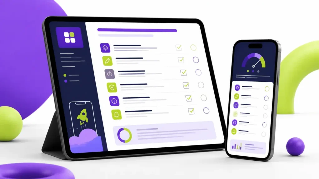
- The Zonqora 35-point app interface scorecard
How Zonqora Can Help
A successful mobile app starts before development. It starts with a clear business goal, strong user flows, intuitive UI design, and a plan for what users should do next.
Zonqora helps businesses create better digital experiences through:
- UI/UX strategy and user-flow planning
- Wireframes and interactive prototypes
- Website design and development
- Ecommerce user-experience improvements
- Conversion-focused landing pages
- Technical SEO and performance optimisation
- AI automation for smarter customer journeys
Whether you are planning a booking platform, marketplace, ecommerce app, real estate app, service app, or internal business system, the goal is the same: create an experience users understand quickly and want to use again.
Final Thoughts
The best mobile app interfaces are not only visually impressive. They are clear, fast, trustworthy, accessible, and designed around real human behaviour.
Duolingo makes learning feel achievable. Airbnb makes booking feel safer. Spotify makes content discovery easier. Uber removes friction from travel. Todoist makes productivity feel simpler.
Your app does not need to copy any of them. It needs to understand its own users, remove their friction, and make the most important action easy.
Looking to improve your app idea, user journey, website, or digital product? Contact Zonqora and let’s build an experience designed for real growth.
Frequently Asked Questions
What is mobile app UI design?
Mobile app UI design is the visual part of an app, including screens, buttons, menus, typography, colours, forms, icons, and animations.
What is the difference between UI and UX?
UI means User Interface—the elements users see and touch. UX means User Experience—the overall journey, ease, speed, and satisfaction users feel while using the app.
Why is UI/UX important for a mobile app?
Good UI/UX can improve user engagement, reduce drop-offs, increase conversions, strengthen trust, and encourage customers to return.
Can an existing mobile app be redesigned?
Yes. An existing app can be improved through a UI/UX audit, user-feedback review, updated user flows, improved visual design, and usability testing.
What should be checked before launching a mobile app?
Before launch, check the user journey, navigation, form flow, loading speed, accessibility, privacy, security, error messages, device compatibility, and conversion actions.